Logo
Prioritize use especially with new audiences.
Primary Logo
The primary logo is a combination of the logo mark in bright green and Atype typeface in dark green. Atype was selected for its modern, industrial aesthetic. The logomark, a geometric wheat spike, feels architectural with three segments signifying the coming together of people, ideas, and resources to help build successful companies.
use when the logo mark appears in another location on the same design.
Word Mark
The wordmark may be used when vertical space is limited or when the mark is being used on the same application in another area.


Use with established audiences when space is limited or as an accent.
Logo Mark
The mark can be used to carry the brand throughout its numerous applications. The primary logo featuring the Plains Ventures name should be used when establishing the brand to new audiences. However, the mark will maintain continuity across supporting designs.
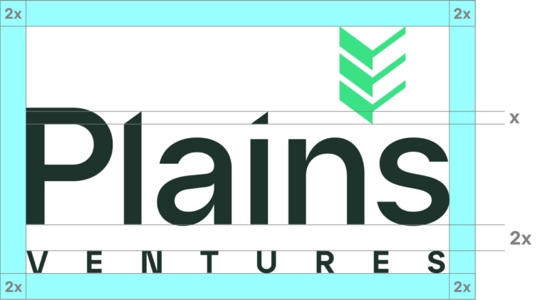
Correctly utilizing safe zone spacing protects the logo and its uses.
Logo Construction & Safe Zone
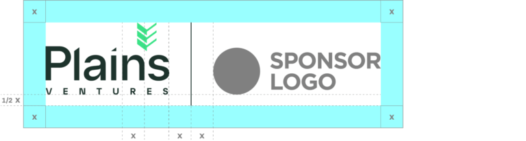
Consistent branding with our partners and sponsors aligns us in our common goals.
Sponsorships & Co-Branding
When co-branding for sponsorship purposes, the total space around and between both logos should be equal to double the height of the glyph above the “i” in “Plains” (see section 4). Align the baselines of the logos vertically and separate the logos with a 1px line. This line should be the height of the logo plus the height of the glyph of the “i”.
The entire logo must be surrounded by twice the amount of space equal to the height of the triangle glyph above the “i” in Plains. This spacing is in proportion to the space between the “Plains” and “Ventures” parts of the logo.